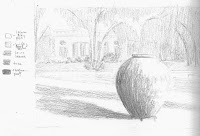
 We had two assignments for this class. The first was to create a painting from a photograph using what we had learned about composition. By cropping the photograph I was able to reposition the jar in one of the 'intersection spots' (Rule of Thirds), strengthening the focal point. This also removed some of the distracting clutter of branches and leaves.
 While working on the value sketch, I removed some of the trees from the background that were competing with the focal point. I lightened the darkest values in the building and trees effectively pushing the background back making the jar stand out even more. I limited the number of values to just five, and noted which elements in the sketch were included in each value. The focal point (the jar) exhibited both the lightest and darkest values.
For the color sketch I used a palette of cadmium red, ultramarine blue and cadmium yellow; with a little raw siena for the trees and jar, and a light wash of cerulean blue for the sky and pool. The light and dark colors alternate in the sketch. The darkly shadowed left side of the jar stands out in contrast from the light greens of the lawn, while the lit right side stands out against the darker shadowed lawn and background.
In the final painting the jar is the obvious focal point, standing out from the Reynold's Mansion in the background. The shadows and lighter blocks of color form lines that lead into the painting from the edges. Tree branches repeat the curve of the jar. The pale windows on the building repeat across the background, their color is repeated in the shadows on the lawn and the jar. The greens of the lawn are repeated in the moss on the jar, and the orange browns in the jar also occur in the background. Repetition of shapes and colors are said to add interest and unity to a painting.


