Sunday, February 22, 2015

More Trout cards

The third trout pattern represents a Rainbow Trout.  These trout have olive-green backs with dark olive to black spots.  A bright pink stripe of color splashes along the mid-line of the body, fading to white on the abdomen.  The small clear scales of the fish produce an iridescence where the light reflects off of them, which I represented by lifting off some of the paint.

I was satisfied with the Brown and Rainbow Trout patterns I had painted, but the Brook Trout pattern didn't look quite correct.  After looking at several photos of Brook Trout I realized what fly fishers refer to as a "worm" pattern on the back and upper sides of the trout resembles patterns seen in some corals.  Also the spots and vermiculate pattern were actually yellow, not white or light olive color which lifting the wet paint had created in previous paintings.  To achieve the pattern seen on the fish in the photos I needed to use a different painting techniques then I had been using so far.

The first step was to lay down a blended wash of Aureolin Yellow across the top of the paper and Cadmium Red Light along the bottom.  The colors join and mix just below the middle of the page.  Before the paint dried I created several "white" spots in the middle and lower half of the painting by lifting off the wet paint.  After the paint dried I added a little Winsor Blue to the "white" spots in the middle to create the halos for the red spots I would add later.

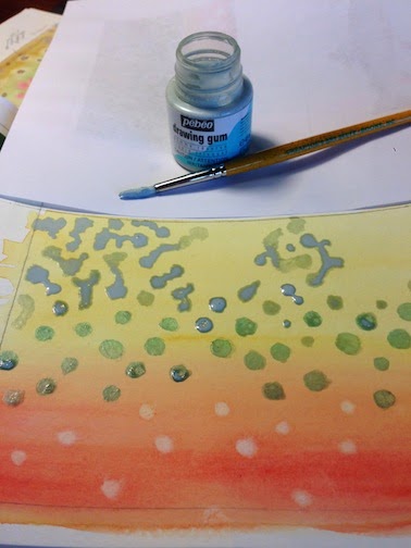
Next I used masking fluid to cover the blue spots in the middle.  I then added additional masking to the upper part of the painting to create the "vermiculate and spot" pattern trout exhibit on their back and upper sides.  In the photo to the left I had already covered the blue spots and was half way through adding additional masking to finish the trout's upper pattern.

Once the masking had completely dried I wet the upper part of the paper using a light mist of clean water.  I added a graded wash composed of a mixture of Sap Green, Burnt Siena and Raw Umber to create the olive-green and brown of the trout's back and upper sides.  Once the final wash was dry I removed the masking to reveal the lighter spots and "worm" pattern.  The photo to the right was taken when I was halfway through removing the masking.


Masking fluid creates a sharp edge where the pigment of the wash could not penetrate the paper.  I softened these edges by adding clean water and lightly rubbing the edges.  The step was to use Rose Madder to add small red spots in the center of the light blue spots.  To the right is a photo of the finished painting.

Sunday, February 15, 2015

Trout cards

I've been working on some drawings and watercolors of trout and flyfishing to use on cards for our Trout Unlimited chapter.

We have three common trout in this area of the country.  Brook Trout (Salvelinus fontinalis)Brown Trout (Salmo trutta) and Rainbow Trout (Oncorhynchus mykiss).  The first species is native to the area, and the last two were introduced.  All three are considered cold water sport fish.  The Wildlife Resources Division and the U.S. Fish & Wildlife Service stock the streams with rainbow, brown and brook trout to keep up with sport fishing demands.

These trout exhibit wonderful patterns of colors, spots and wiggly lines.  After looking at several photos of trout I started working on some cards that just show the patterns.  Below are patterns on a Brook Trout and a Brown trout.


Sunday, January 25, 2015

Salmon of Knowledge art book project

I started on a new art book project, illustrating a handmade accordion book based on the celtic myth about the Salmon of Knowledge.  The story is short and perfect for several illustrations incorporating celtic designs.  This will be my first finished project that encompasses drawing, painting and bookbinding.

First I printed out a draft of the text, and used it to put together a mock up of the book using card stock.  This helped me decide on the subjects for the small illustrations, as well as the placement of the text blocks and illustrations on each page.  It is much better to figure this all out ahead of time.  In the end I found I would need eight pages, one for the title and seven more with text and illustration.  Two additional end pages would be needed to attach the book covers.


With accordion folds the front and back of the pages can be seen, so I developed eight small sketches for the text side of the book and one long sketch to span the entire back of all eight text pages.


I tested different combinations of colors and media on the illustrations to find the right look.  I worked with sepia, black, colored and metallic markers as well as a variety of watercolor pigments. The watercolors provide varied colors (fish at far right), while the metallic ink has a wonderful bright shine (fish at near right).  For this book I will be using a combination of both watercolors and metallic ink.

I decided to use 90 lb multi-media paper instead of watercolor paper for the book pages, since it will stand up to repeated folding better than watercolor paper.  To have a single long piece of paper for the text block, I would need a 35" long piece of paper.  I purchased a roll of Cason XL paper.  I cut a 5" strip from the roll and trimmed it to the desired 35" length.  Then I folded the long strip into 10 3.5" x 5" pages and pressed the accordion flat.  This was the first time I had used rolled paper and I didn't anticipate how resistant to being uncurled the paper would be.  Lesson learned: carefully uncurl the paper first!

I transferred the illustrations to the paper, and then carefully inked and painted.  I worked on the small illustrations first, then on the large illustration that spans the reverse side of the paper.  My original plan was to print the text directly on the paper, but because of the odd paper size (5" by 35") my printer would not cooperate.  After fighting with it for several hours I decided to finish this book and work on the printer later.  For this book I printed the text on velum, cut it to size and glued each section of text to the pages.  The text block was now finished and ready for the covers to be attached.

I selected a decorative paper with a Japanese looking wave pattern called Yuzen Black Gold Waves for the book covers.   For the closure glued a black ribbon to the inside of the front cover, and I chose a gold colored button that I sewed to the outside.  The ribbon is long enough to wrap around the book once and then wrap around the button.

Except for not being able to print the text onto the paper, this book turned out well.  The multi-media paper worked fine for both ink and watercolors.  I like how the book covers turned out and how the final illustrations look.


I am especially happy with the large illustration that spans the back of the book's pages.