During the week we would study each part that makes up a landscape painting: the sky, the the trees (near and far) and distant hills. We began with the sky. Marilynn demonstrated methods for creating smooth washes that are darker at the top and lighter at the bottom, mimicking what a typical sky looks like.
Skies often includes clouds, and there are many types of clouds each with their own distinct form and implied weather conditions. In addition, clouds are not white. They are made up of water that reflects the colors around them. This is why at sunrise or sunset clouds turn various shades of red, orange, yellow and violet. Marilynn demonstrated several different techniques for creating the hard and soft edges clouds exhibit.
To start with we did studies of skies and clouds from photos to learn the demonstrated techniques:
Cirrus are wispy upper level clouds. I grew up calling them 'Mare's tails', and knew if I saw them we would have a good breeze for sailing, but that a low-pressure weather disturbance was headed our way. The lower clouds were done wet-on-wet for soft edges, the upper clouds were lifted. I used Cerulean Blue (lower sky), Ultramarine Blue (upper sky) and Windsor Orange (for sand and mixed with the Ultramarine Blue for the ocean).
Altostratus are mid level clouds, similar to the low level Stratus clouds that form continuous layers of cover in the sky.
The underside of the clouds are reflecting the pink of the setting sun. Additions of color can create a dramatic effect. This sketch was done using Cerulean Blue (lower sky), Ultramarine Blue (upper sky) and Quinacridone Rose.
Stratocumulus clouds form at all levels, and have both cumuliform and stratiform characteristics (puffy and sheet like). These clouds were done wet-on-wet using Cerulean Blue (lower sky), Ultramarine Blue (upper sky) and Windsor Orange (shadows). Only the cloud on the horizon has any hard edges. The ocean is a mix of the same colors, slightly darker and paler.
Cumulus clouds are lower level clouds. They have flat bases with puffy tops. This was an attempt at mixing hard (puffy tops) and soft edges (flat bases). Water was applied to the sky leaving the clouds dry. Then the sky wash was carefully added. There are some plumes where I added too much water when working the hard edge of the top cloud. The color shift in the sky and the smaller lower clouds add perspective to the sketch. The sketch was done using Cerulean Blue (lower sky), Ultramarine Blue (upper sky) and Windsor Orange (shadows).
After finishing our studies we headed outside to paint some real clouds plein air. Earlier in the day the sky had been filled with puffy white clouds. When we ventured outside all the big clouds had vanished. We were left with three or four tiny clouds on the horizon between the distant mountains to paint. They proved to be very hard to paint, as they continuously changed shape and repeatedly slipped out of view behind the trees. It wasn't until we were finished for the day that the clouds came out of hiding and re-filled the sky. I guess they were just shy.


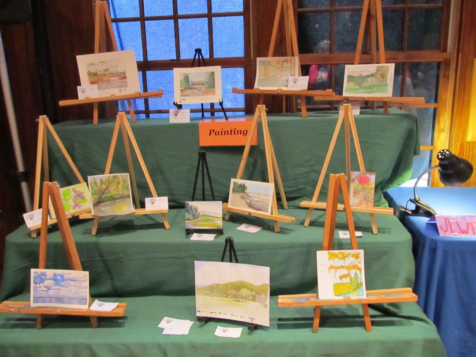
 Finally we cleaned up the studio and got ready for the student exhibit where all the classes displayed what they had spent the week working on. Ours were just two of the thirteen classes being taught that week. It is always amazing to see what we all managed to accomplish in just a week!


