Monday, September 30, 2013

Small florals

I had intended on painting three 5 x 7 watercolor florals as possible entries to the Small Works Exhibit, but I only managed to paint two.  Like the small landscapes I am using Strathmore windpower 140 lb watercolor paper.  

The first one I painted is a small version of the apple blossom cluster I painted last spring.  I positioned the flower cluster so that it fills 7/8 of the paper.  Since this left only small bits of background I didn't mask the flowers, I just carefully painted around them.  I used a palette of Cobalt Blue, Chrome Yellow, Aureolin Yellow, Quinacridone Gold and Quinacridone Rose.  

The second is a closeup of a Swamp Sunflower.  I masked the sunflower and used a wet-on-wet glazing technique I learned in Margaret Walsh Best's workshop to paint the background.  I used Cobalt Blue, Chrome Yellow, Aureolin Yellow and Quinacridone Gold to produce the impression of an out of focus field of flowers.  I used the same pigments along with Burnt Siena, Raw Umber to achieve the variety of shades in the close sunflower.  The final touch is a Cadmium Red floret.  A sunflower is a composite flower.  A corolla of 'petal-like' ray flowers circle the dense disk of tightly packed small florets.
    

Sunday, September 22, 2013

Small Landscapes

Over the past week I painted six small 5 x 7 landscapes as possible entries to the Small Works Exhibit.  I am using Strathmore windpower 140 lb watercolor paper for these paintings.  The pad I am using is large enough to paint two 5 x 7 paintings on the same page.  This makes it easily to compare the two versions while I am working on them.

Two are smaller versions of the Isle of Sky paintings I had recently done.  Using the same pigments that I used previously:  Phthalocyanine Blue, Ultramarine Blue, Chrome Yellow, Aureolin Yellow, Burnt Siena and the shadow color mix I learned in Margaret Walsh Best's workshop At this smaller size the colors are richer and more intense.  Which just points out why I need to create bigger richer puddles of pigment when I do larger paintings.


Two are a smaller version of the dunes on Sapelo Island at sunrise, with a new interpretation of the shadows in the scene and using a new mix of pigments.  I used Ultramarine Blue, Chrome Yellow, Aureolin Yellow, Quinacridone Rose, Quinacridone Gold, Burnt Siena, the shadow mixture and the sky in the second version uses Cerulean Blue.  The second version has fewer creeping dune plants and a lighter shadow in the sand.  


Two are new versions of a watercolor journal entry of the marsh at Little St. Simons Isl.
 I used Phthalocyanine Blue, Ultramarine Blue, Chrome Yellow,  Quinacridone Gold, Burnt Siena and the shadow mixture to deepen the darkest shadows.


Saturday, September 14, 2013

Exhibiting yikes!

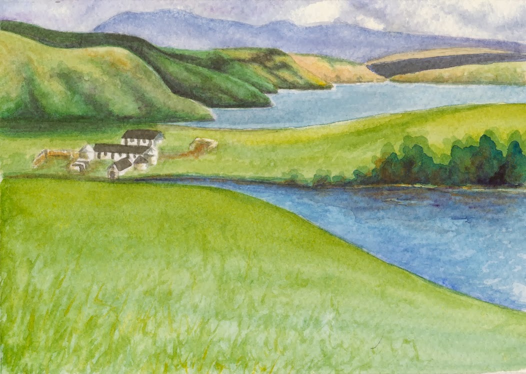
I decided to take the plunge and enter some artwork in an exhibit.  I found a local juried exhibit, Georgia Small Works, that accepts entries up to 14" x14" including the frame.  The catch is most of my recent paintings are bigger then that.  I think I have just enough time to paint three small, 9" x 5" watercolors and frame them for this exhibit.

Since I can't decided if I should do landscapes or florals, I am going to do a few of each and pick the best to enter in the exhibit.


Now I need to get painting!