Saturday, August 22, 2015

Leather quote books

As a special request, I am binding some small leather books that have pages sized perfectly for one special quote.

Quotes come from many sources; family, friends, a favorite line from a book, song or movie.  Some quotes can make you laugh, others can inspire.  A quote can remind you of the person who said it, the place you were when you first heard it, or the feelings you had at the time.  Collecting quotes, sayings or proverbs allows you to re-read them whenever you want.  The perfect place to save your favorite quotes is in a handmade book.  A place you can personalize the quotes with doodles, sketches and drawings.  A place that can grow to include a life's worth of quotes.

"If its worth writing, its worth writing in a handmade book"
  Hollis Fouts

The first one has a black leather wrap cover with a large wooden button closure.  There are 50 landscape oriented pages, divided into five signatures of 5 folios each.  French speckled 80 lb paper was used, and the first and last signature have tipped in maroon colored end papers.  Red Crawford 4 ply waxed linen thread was used to bind the book and attach the wooden button.  The leather wrap was cut in a semicircle, and a hand decorated wooden button was added for the closure.


The second one has a red suede leather wrap cover.  The ten signatures contain five folios, forming 100 portrait oriented pages.  Japanese inspired blue and gold wave pattern paper was used for the end papers on the first and last signatures.  To match the end papers, torquise Crawford 4 ply waxed linen thread was used to bind the book.  Two signature templates were required for the binding pattern.  The leather wrap was cut at an angle to match the diamond shaped raku button used for the closure.


Thursday, August 13, 2015

Volunteer Sunflowers, part 3


The tale of the Sunflowers didn't end with my painting.  After the flowers were pollenated, the ray flowers shriveled and fell off and the flower heads drooped.  It would take several weeks for the seeds to finish maturing and be ready to harvest.  My plan was to harvest and dry the flower heads with the seeds intact, to later user to feed the birds.  Every few days I checked to see if they were ready to be harvested.

One day I found cracked sunflower seeds on the backs of the flower heads.  Birds had discovered the seeds and were beginning to eat them.  Over the next week I watched Gold Finches, Cardinals and Crows come to the garden and wrestle individual seeds from the flower heads.  The flowers that had fed the bees, and provided me with beautiful subjects to paint were now feeding the birds too.

Seeds were pulled from the edges first, then further towards the middle as they too matured.  The birds had to be quite acrobatic to remove the seeds, hanging over the edge of the flower, or even upside down.  Their struggles would make the flowers shake violently.


Sunday, August 2, 2015

Volunteer Sunflowers, part 2


I spent a lot of time studying the sunflowers before deciding what to paint and how to approach the painting.  In the end I decided on an off center close up of the flower with a single Bumble bee feeding.

The disc florets spiral out from the center in Fibonacci sequence.  This pattern provides the optimal number of flowers and seeds for the given space.  The pattern can be easily seen in the un-opened disc flowers at the center.  My pencil sketch included the placement of the ray flower petals and the spiral lines in the center's unopened florets.

The palette I worked with included warm and cool yellows and blues; as well as Yellow Ochre, Burnt Siena and Burnt Umber.  The whole central part of the flower would involve a lot of negative painting.  Using the cool yellow I painted the whole center of the disk.  A wash of blue and warm yellow was added the center.  Warm yellow was used for the ray floret petals around the disk.  Then working from the outer edge of the disk inwards, Burnt Sienna was add to define the spent disk flowers.  Yellow was mixed in to the Burnt Siena to lighten the color as I moved toward the center and began to define the open disk florets.  Additional colors were added to darken the spirals in the center and define the unopened florets.


Background color was added between the petals and additional shades of yellow were used to continue to define the open disk flowers.  The bee was painted.  Many additional layers of color were added to develop the background, flower and bee.


Sunday, July 26, 2015

Volunteer Sunflowers, part 1

This year I have several volunteer sunflowers growing up in the herb garden.  Some have large single flowers and others have multiple smaller flowers.  One thing they all have in common is they tower over the much shorter herbs, gently nodding in the breeze.  The herbs have small flowers that generally attract small insect pollinators.  The sunflowers, however, attract larger pollinators.  Large carpenter bees and bumble bees, in addition to the smaller honey bees and native bees are all attracted to the sunflowers.

Sunflowers (Helianthus spp.) are annuals native to North America.  Their flowers have large centers composed of many small five-petaled florets (disk flowers) that spiral toward the center.  The outer most florets resemble petals (ray flowers).  The disk flowers on the outer edge mature first, then the next row of florets, and the next, until all the florets have opened and been pollinated.   Each composite flower is a food source for days or even weeks.

The two large bees I see most often are the Impatient Bumble bee (Bombus impatiens) and the Eastern Carpenter bee (Xylocopa virginica).  Bumble bees are smaller then Carpenter bees and have a fuzzy appearance due to numerous small hairs on their abdomen and thorax.  The larger Carpenter bees have a shiny black abdomen that is hairless.  The Impatient Bumble bees yellow hair is so pale it seems white.

Carpenter Bees are considered pests because they drill into wooden fences and buildings causing structural damage.  Bumble bees, like honey bees, are beneficial insects, and are responsible for pollinating many plants including food crops.


Monday, July 13, 2015

Apple while away

I recently took my Van Gogh watercolor Pocket Box with me to a conference, assuming I would findsomething to paint.  They was a nice view from the room, but each time I tried to paint the view I was chased inside by violent rain storms.  I ended up with some half painted landscapes.

The one sketch I was able to finish I did inside, of an apple.  The apple was a colorful mix of red, yellow and green.  The desk light cast deep shadows similar to the orange I painted on another trip.  The reflected light created highlights around the top of the apple.

Saturday, June 20, 2015

Brook trout

On a recent trip to North Carolina I was able to do some fly fishing on the North Mills River.  It is a tranquil river with lots o big rocks, riffles and deep pools for trout.  I like nothing better then to stand in the river's shallows and watch a trout rise to the fly I am floating down river.

Sometimes all I see is a dart, a quick look and total dismissal from the fish.  The fly was the wrong color or style, didn't smell right, floated to high in the water, moved to fast or not fast enough.  Whatever was wrong it was wrong enough to make the fish decide to pass on my offer.  The only reason I see these fish is the flash of their lighter underside as they make the quick turn back down to the depths of the pool.

Other times the fish takes a quick bite, only to spit the fly out and dive even quicker.  I'm sure the feathers, fur, thread, plastic and metal bits that make up my flies are not anything like a tasty bug.  Less often are the times the fish gulps the fly and I set the hook.  If I keep the line tight while I reel in the fish I have the opportunity to see its beauty up close, and briefly marvel over the colors and patterns covering the fish that live in the these beautiful cold water mountain streams.

I took a photo of a trout I caught on the Mills River before I released it, and later that day painted the fish.
 

Monday, May 18, 2015

Little St. Simons Isl GA

The Georgia coast wears a necklace of barrier islands nestled in a large expanse of marshes.  Tybee, Little Tybee, Wassaw, Ossabaw, Blackbeard, Sapelo, St. Catherines, Wolf, Little  St. Simons, Sea Island, St. Simons, Jekyll, Little Cumberland, and Cumberland Islands; though similar in origin are each a unique jewel.
  • Four are developed, having bridges that span the marshes allowing tourist to flock to the "Golden Isles".  
  • Two have regular ferries that transport people on and off on a daily basis.  
  • Three have docks and semi-regular boat traffic for the people who inhabit the islands and their visitors.
  • Five are uninhabited.  

Recently I was able to visit St. Catherines Island, the only barrier island I had not previously visited.  The island is approximately ten miles long by two miles wide.  It has wide sandy beaches, extensive marshes and densely forested upland areas.  It is one of the islands with semi-regular boat traffic.    

Long before Europeans arrived on this continent, the island was used by Native Americans.  The first Spanish outpost in Georgia was built on this island, and the mission Santa Catalina de Guale was located on the island from 1602 to 1680.  Dr. David Hurst Thomas, from the American Museum of Natural History, who has been exploring the island since the mid-1970s discovered the location of the mission site, numerous shell rings and burial sites.  More than a million objects were identified from these explorations.    

St. Catherines is currently a private island owned by the St. Catherines Island Foundation, operated for charitable, scientific, literary, and educational purposes.  For many years the island was used by the New York Zoological Society for endangered species breeding research, and some these animals still inhabit the island.  Seven troops of Ring-tailed Lemurs still roam the island.  They are quite inquisitive and unafraid of people.  Some of the Lemurs have been fitted with collars that are used to track their movements around the island.

The Lemurs have narrow faces and long bushy tails with 12 to 14 alternating black and white rings.  Their dense fur is grey to reddish brown on their backs, white on their chest and they have triangular patches black fur around their eyes and nose.  I was drawn to the rich color and luminous quality of the Lemur's eyes.  This is due to a reflective layer behind the retina of the eye called the tapetum lucidum.

I made two small watercolor sketches of the Lemurs I met while visiting their island.


Wednesday, April 1, 2015

Colorful Orchids

My last visit to Asheville started on a warm day, perfect weather for plein air sketching.  Overnight the temperature dropped and the light rain turned to snow!  My ambition to walk around outside sketching also dropped.  As it turned out I was in luck.  The North Carolina Arboretum just happened to be hosting the 2015 Western North Carolina Orchid Society annual show.  Thousands of orchids filled the downstairs of their Education Building, providing me with numerous subjects to paint.  There were a lot of people viewing and photographing the orchids, including me.

The Orchid family is one of the largest families of flowering plants, with roughly 25,000 species.  They exhibit a dizzying variety of sizes, shapes and colors.  After taking many photos of different orchids I headed over to the cafe for an early lunch.  While in the cafe I did a watercolor of one of the orchids I had photographed.  I had brought my small watercolor journal kit that has a Van Gogh watercolor Pocket Box.  I used a palette of warm and cold shades: yellow (254, 269), red (311, 370), blue (506, 535) and burnt sienna (411).

As noon approached and the number of people looking for lunch increased, I decided to relocate to the other building.  There I found a comfortable chair near the fireplace, which had a lovely fire going, and did four more little watercolors.  I say little because I was using a Strathmore spiral bound 3" x 5" book.


Sunday, March 15, 2015

Colorful Salmon flies

I recently read an article about historic fly patterns used for Salmon fishing.  Salmon flies are nothing like the tiny drab colored insect mimic flies I have in my fly boxes.  Salmon flies are big, and bright and often mimic small fish.  I picked four beautiful fly patterns to paint for use on note cards.  Wet on wet was used to blend the base feather colors.  Additional details on the large feathers and the hackles were dry brushed.

The "Durham Ranger" is a quintessential classic pattern.  These intricately dressed flies were used for Atlantic salmon fly fishing during the nineteenth and twentieth centuries.  Fly patterns from that time used colorful feathers from large, and often exotic birds.  Today, tying these flies is considered an art.

Bits of fur, feathers and shinny tinsel are carefully tied to a hook to imitate insects, fish, other foods or just something that will catch a fish's interest.  The "Policeman" was designed for Salmon fishing on the river Tay in Scotland.  In the water, this fly imitates a bait fish.  

Different patterns are used for different types of fish and for fish from different locations.  The "Rock Island" streamer is a modern fly designed for trout fishing in British Columbia (Designed by Monte Smith).

The "Copper Lake" is a modern classic in the "Ghost" style (Designed by Monte Smith).  The first of this style, the "Grey Ghost" pattern, was created by Carrie G. Stevens, a self-taught fly tier from Maine.  The streamer was designed to be used for river casting and resembled the bait fish found there.  It remains a popular fly pattern and is still used for Atlantic trout and salmon fishing.


Sunday, February 22, 2015

More Trout cards

The third trout pattern represents a Rainbow Trout.  These trout have olive-green backs with dark olive to black spots.  A bright pink stripe of color splashes along the mid-line of the body, fading to white on the abdomen.  The small clear scales of the fish produce an iridescence where the light reflects off of them, which I represented by lifting off some of the paint.

I was satisfied with the Brown and Rainbow Trout patterns I had painted, but the Brook Trout pattern didn't look quite correct.  After looking at several photos of Brook Trout I realized what fly fishers refer to as a "worm" pattern on the back and upper sides of the trout resembles patterns seen in some corals.  Also the spots and vermiculate pattern were actually yellow, not white or light olive color which lifting the wet paint had created in previous paintings.  To achieve the pattern seen on the fish in the photos I needed to use a different painting techniques then I had been using so far.

The first step was to lay down a blended wash of Aureolin Yellow across the top of the paper and Cadmium Red Light along the bottom.  The colors join and mix just below the middle of the page.  Before the paint dried I created several "white" spots in the middle and lower half of the painting by lifting off the wet paint.  After the paint dried I added a little Winsor Blue to the "white" spots in the middle to create the halos for the red spots I would add later.

Next I used masking fluid to cover the blue spots in the middle.  I then added additional masking to the upper part of the painting to create the "vermiculate and spot" pattern trout exhibit on their back and upper sides.  In the photo to the left I had already covered the blue spots and was half way through adding additional masking to finish the trout's upper pattern.

Once the masking had completely dried I wet the upper part of the paper using a light mist of clean water.  I added a graded wash composed of a mixture of Sap Green, Burnt Siena and Raw Umber to create the olive-green and brown of the trout's back and upper sides.  Once the final wash was dry I removed the masking to reveal the lighter spots and "worm" pattern.  The photo to the right was taken when I was halfway through removing the masking.


Masking fluid creates a sharp edge where the pigment of the wash could not penetrate the paper.  I softened these edges by adding clean water and lightly rubbing the edges.  The step was to use Rose Madder to add small red spots in the center of the light blue spots.  To the right is a photo of the finished painting.

Sunday, February 15, 2015

Trout cards

I've been working on some drawings and watercolors of trout and flyfishing to use on cards for our Trout Unlimited chapter.

We have three common trout in this area of the country.  Brook Trout (Salvelinus fontinalis)Brown Trout (Salmo trutta) and Rainbow Trout (Oncorhynchus mykiss).  The first species is native to the area, and the last two were introduced.  All three are considered cold water sport fish.  The Wildlife Resources Division and the U.S. Fish & Wildlife Service stock the streams with rainbow, brown and brook trout to keep up with sport fishing demands.

These trout exhibit wonderful patterns of colors, spots and wiggly lines.  After looking at several photos of trout I started working on some cards that just show the patterns.  Below are patterns on a Brook Trout and a Brown trout.


Sunday, January 25, 2015

Salmon of Knowledge art book project

I started on a new art book project, illustrating a handmade accordion book based on the celtic myth about the Salmon of Knowledge.  The story is short and perfect for several illustrations incorporating celtic designs.  This will be my first finished project that encompasses drawing, painting and bookbinding.

First I printed out a draft of the text, and used it to put together a mock up of the book using card stock.  This helped me decide on the subjects for the small illustrations, as well as the placement of the text blocks and illustrations on each page.  It is much better to figure this all out ahead of time.  In the end I found I would need eight pages, one for the title and seven more with text and illustration.  Two additional end pages would be needed to attach the book covers.


With accordion folds the front and back of the pages can be seen, so I developed eight small sketches for the text side of the book and one long sketch to span the entire back of all eight text pages.


I tested different combinations of colors and media on the illustrations to find the right look.  I worked with sepia, black, colored and metallic markers as well as a variety of watercolor pigments. The watercolors provide varied colors (fish at far right), while the metallic ink has a wonderful bright shine (fish at near right).  For this book I will be using a combination of both watercolors and metallic ink.

I decided to use 90 lb multi-media paper instead of watercolor paper for the book pages, since it will stand up to repeated folding better than watercolor paper.  To have a single long piece of paper for the text block, I would need a 35" long piece of paper.  I purchased a roll of Cason XL paper.  I cut a 5" strip from the roll and trimmed it to the desired 35" length.  Then I folded the long strip into 10 3.5" x 5" pages and pressed the accordion flat.  This was the first time I had used rolled paper and I didn't anticipate how resistant to being uncurled the paper would be.  Lesson learned: carefully uncurl the paper first!

I transferred the illustrations to the paper, and then carefully inked and painted.  I worked on the small illustrations first, then on the large illustration that spans the reverse side of the paper.  My original plan was to print the text directly on the paper, but because of the odd paper size (5" by 35") my printer would not cooperate.  After fighting with it for several hours I decided to finish this book and work on the printer later.  For this book I printed the text on velum, cut it to size and glued each section of text to the pages.  The text block was now finished and ready for the covers to be attached.

I selected a decorative paper with a Japanese looking wave pattern called 
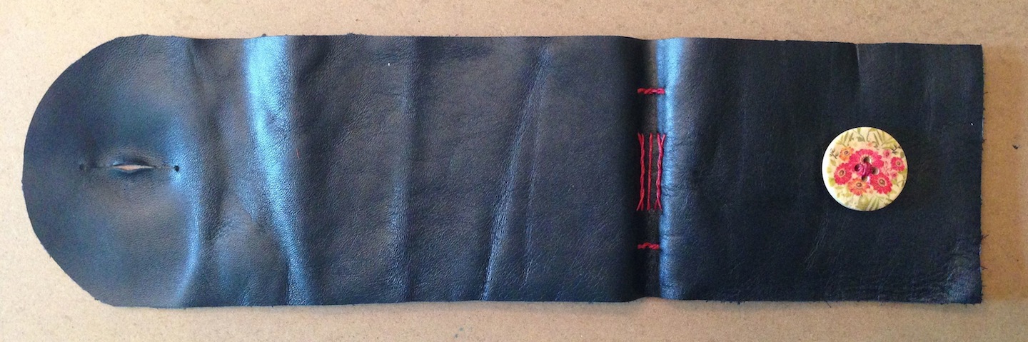
Yuzen Black Gold Waves for the book covers.   For the closure glued a black ribbon to the inside of the front cover, and I chose a gold colored button that I sewed to the outside.  The ribbon is long enough to wrap around the book once and then wrap around the button.

Except for not being able to print the text onto the paper, this book turned out well.  The multi-media paper worked fine for both ink and watercolors.  I like how the book covers turned out and how the final illustrations look.


I am especially happy with the large illustration that spans the back of the book's pages.