Sunday, December 1, 2013

Getting ready for the exhibit

I needed to decide which three of the eight 5" x 7" paintings to enter in the exhibit.  To help me determine what the finished paintings would look like I first needed to mat them.

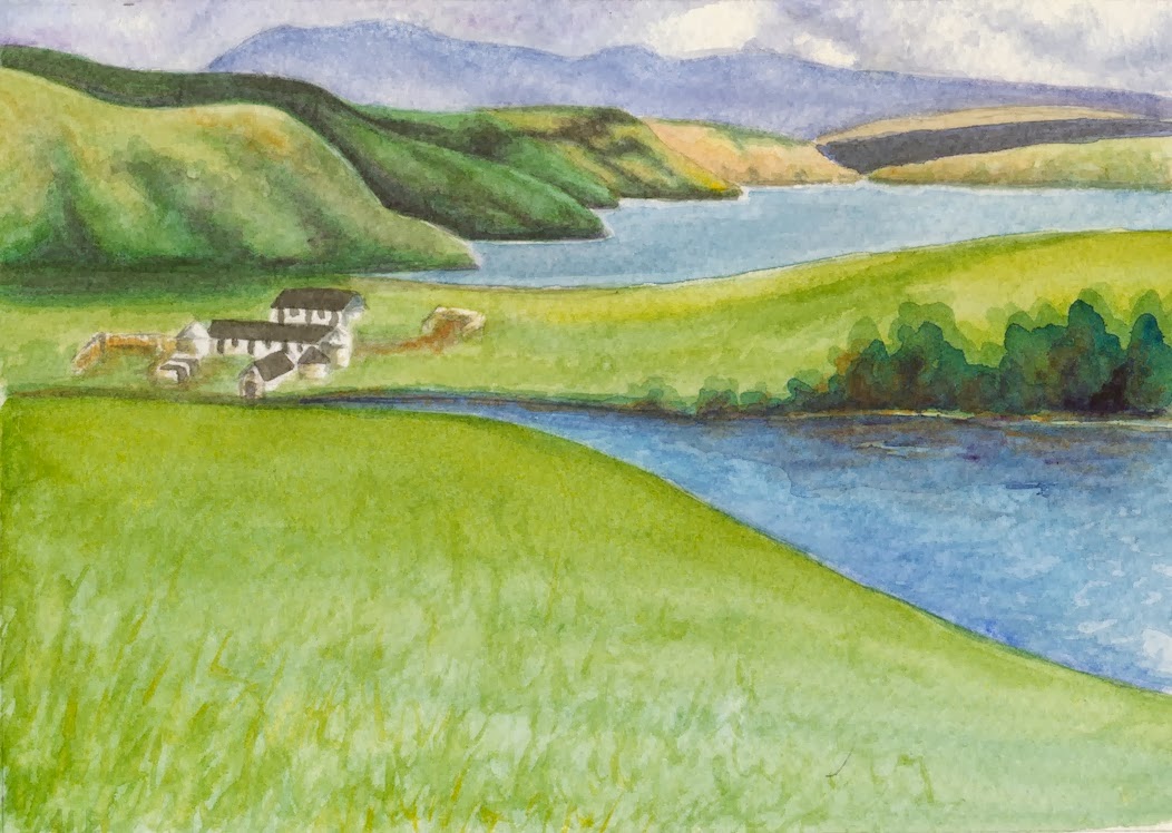
I didn't want the amount of mat to overwhelm these small paintings, so I used 1.5" wide mats.   I spent some time testing different colored mats with the paintings.  The often repeated recommendation is to use neutral off white colors.  I found different colors worked with different paintings.  Some looked best with tan or pale shades of green, others looked best with darker blues and greens.  When the right mat was used the the painting seemed to jump to life.   I tried single mats and double mats, and found that I consistently preferred double mats.  

Matted and sitting side by side it was easy to pick out 4, but eliminating one more from the group was a lot harder.  I ended up with two landscapes and one floral.  Now I needed to work on the framing.

I wanted the frames to complement the painting and fit their style.   After looking at a lot of frames I selected simple dark wood frames for the landscapes and gold frames with a bit of a decoration for the florals.   Now all the pieces needed to be put together.

The glass was cleaned and dried.  The paintings were attached to the back of the mats using two pieces of acid free water soluble gummed tape along the top of the paper.  The matted paintings were placed on top of the glass.  Acid free tissue paper barrier was placed between the paintings and the backing board.  The whole stack was secured in the frame.  A brown paper dust cover was added to the back of the wood frame.  The final step was to add eye hooks and attach twisted wire to them to hang the paintings.

Then off to deliver the paintings I went.  None of them were chosen for the exhibit, but these were the first watercolors I had framed so it was a good learning experience for me.  

Monday, September 30, 2013

Small florals

I had intended on painting three 5 x 7 watercolor florals as possible entries to the Small Works Exhibit, but I only managed to paint two.  Like the small landscapes I am using Strathmore windpower 140 lb watercolor paper.  

The first one I painted is a small version of the apple blossom cluster I painted last spring.  I positioned the flower cluster so that it fills 7/8 of the paper.  Since this left only small bits of background I didn't mask the flowers, I just carefully painted around them.  I used a palette of Cobalt Blue, Chrome Yellow, Aureolin Yellow, Quinacridone Gold and Quinacridone Rose.  

The second is a closeup of a Swamp Sunflower.  I masked the sunflower and used a wet-on-wet glazing technique I learned in Margaret Walsh Best's workshop to paint the background.  I used Cobalt Blue, Chrome Yellow, Aureolin Yellow and Quinacridone Gold to produce the impression of an out of focus field of flowers.  I used the same pigments along with Burnt Siena, Raw Umber to achieve the variety of shades in the close sunflower.  The final touch is a Cadmium Red floret.  A sunflower is a composite flower.  A corolla of 'petal-like' ray flowers circle the dense disk of tightly packed small florets.
    

Sunday, September 22, 2013

Small Landscapes

Over the past week I painted six small 5 x 7 landscapes as possible entries to the Small Works Exhibit.  I am using Strathmore windpower 140 lb watercolor paper for these paintings.  The pad I am using is large enough to paint two 5 x 7 paintings on the same page.  This makes it easily to compare the two versions while I am working on them.

Two are smaller versions of the Isle of Sky paintings I had recently done.  Using the same pigments that I used previously:  Phthalocyanine Blue, Ultramarine Blue, Chrome Yellow, Aureolin Yellow, Burnt Siena and the shadow color mix I learned in Margaret Walsh Best's workshop At this smaller size the colors are richer and more intense.  Which just points out why I need to create bigger richer puddles of pigment when I do larger paintings.


Two are a smaller version of the dunes on Sapelo Island at sunrise, with a new interpretation of the shadows in the scene and using a new mix of pigments.  I used Ultramarine Blue, Chrome Yellow, Aureolin Yellow, Quinacridone Rose, Quinacridone Gold, Burnt Siena, the shadow mixture and the sky in the second version uses Cerulean Blue.  The second version has fewer creeping dune plants and a lighter shadow in the sand.  


Two are new versions of a watercolor journal entry of the marsh at Little St. Simons Isl.
 I used Phthalocyanine Blue, Ultramarine Blue, Chrome Yellow,  Quinacridone Gold, Burnt Siena and the shadow mixture to deepen the darkest shadows.


Saturday, September 14, 2013

Exhibiting yikes!

I decided to take the plunge and enter some artwork in an exhibit.  I found a local juried exhibit, Georgia Small Works, that accepts entries up to 14" x14" including the frame.  The catch is most of my recent paintings are bigger then that.  I think I have just enough time to paint three small, 9" x 5" watercolors and frame them for this exhibit.

Since I can't decided if I should do landscapes or florals, I am going to do a few of each and pick the best to enter in the exhibit.


Now I need to get painting!


Saturday, August 31, 2013

Dynamic compositions: the Isle of Skye


I wasn't able to spend a lot of time in my studio this month, but what time I did spend was working on watercolors based on the Isle of Skye sketches I developed in Barbara Jaenicke's  Landscape composition class at the Spruill Center for the Arts in Atlanta Georgia.  


The Isle of Skye is full of dramatic scenery.  It is the most northerly isle of the Inner Hebrides on the west coast of Scotland.  Wind, water and sky have shaped the island, and these elements are ever present in the landscape.  About a half dozen settlements hug rocky shored harbors around the isle.  The coast is a sinuous line of bays and rivulets radiating out from the center of the isle.  The central part of the isle has numerous mountains called Cuillins.  The Black Cuillin's are mostly basalt, while the Red Cuillin are mostly granite.  Hill walking on Skye is popular and often challenging.  The Cuillin's stark colors stand out against the contrasting blue sky and green moors.  The lack of trees allow the ubiquitous clouds to paint shadow patterns across the land.

I ended up painting two versions of the first sketch.  In the first one the fields in the foreground are a green that shades to blue, and the blues of the water are close to the blues of the sky and clouds.  The feel of this painting reminds me of the Isle of Skye, when the clouds were building for another afternoon rain shower.

In the second painting the green shades to yellow, and the blue of the water has more red in it. Bringing the color of the water closer to the blue-purple of the distant mountains and clouds.  This painting feels more like after the rain had finished and the sky was clearing.  It would rain multiple times a day, but be wonderfully clear in-between each shower.

The painting of the second sketch used a palette similar to the second painting, where the foreground green shades to yellow.  It has a bit more burnt sienna and the closer mountains have more green than blue in them.  I masked the house group while I painted the rest of the landscape, which made the washes much easier to do.  I finished the foreground field with some dry brush strokes while the paper was still wet to let them fade and mix.


Sunday, August 18, 2013

The beauty of glass beads

Steve has been busy in his studio creating lots and lots of beautiful glass beads.  Over the last several weeks dots, encased dots, plunge dots, wraps, spirals, florals, dichroic, monochromatic, hollow, beads within beads, and organic beads slowly but surely began filling bowls in the kitchen and dining room.  It seemed that anywhere you looked there was a container of beads.

While beautiful by themselves, the beads were not meant to fill bowls, but to be used in earrings, bracelets and necklaces.  We enlisted the help of Steve's sister and niece, who have been making jewelry for awhile, to design some jewelry with the beads.

While they were busy making jewelry, Steve went back to making more beads.  The bowls quickly filled up again and it was time for us to start making jewelry too.


We needed earring and necklace designs for all the new beads.  We looked at examples of lots and lots of jewelry, and I worked up a few sketches based on what we liked.  The designs would highlight the beauty of the beads, not overshadow them.  In the mean time, the beads Steve's sister and niece had been working on came back all neatly wrapped.  We looked at what they had done with the beads, and had several conversations about styles, color combinations, materials, tools, sources, etc.

With beads and designs in hand, it was time to put it all together.  We spent several evenings matching colors, stringing beads, bending wire and wrapping beads.  Now instead of bowls of beads we have beautiful earrings and necklaces!

Sunday, August 11, 2013

Developing dynamic compositions in landscape paintings

I recently attended a one day class on landscape composition at the Spruill Center for the Arts in Atlanta Georgia.  The instructor, Barbara Jaenicke, is an accomplished pastel and oil artist.  The workshop, however, was open to artists of all media and drew artists who work in pastel, acrylic, oil and watercolor.  The focus of the workshop was blocking out dynamic compositions.  No finished work was created during the workshop.

Barbara did two demos to explain the concepts of blocking out dynamic compositions from photos, one in pastel the other in oil.  It was very interesting to watch an artist working in a media I have never work in.  Creation of composition and value sketches are the same for all medias.  The real difference between the medias is in the next step.  For both pastels and oils an under painting outlining the values (oils) or temperature (pastels) is created.  This underpainting is dark, and later layers will be lighter.  Underpaintings in watercolors are light, and later layers will be darker.

Over the course of the workshop I worked from three photos, one taken on the Isle of Skye, Scotland (photo to left), one taken at the John C. Campbell School, NC, and one taken while fishing a Trout stream near Asheville NC.   I developed pencil sketches diagraming the overall compositions and values.  The next step was to use the pencil sketches to create watercolor block sketches.  These sketches do not have details, just colors with the same values as the pencil sketches.

I used the Isle of Skye photo (above) to develop sketches for two distinct paintings.   One focuses on the water as it flows through the land.  swaths of land and water zig zag across the paper, drawing the eye through the foreground into the mountains in the background.


The other focus on the buildings sitting between the hills and the water.  The angular shapes of the land and water draw the eye to the buildings.


Barbara encouraged us to develop our sketches, and helped us focus on the compositions in the sketches and not jump into working on full paintings.  The small sketches are used to decide if the composition warrants a full painting, or needs some additional refinement.  I am currently working on watercolor paintings, based on these two sketches developed during the class.
 

Sunday, August 4, 2013

Project Robin: fourth painting

The Robin in the third painting was much better, but due to flaws in the paper, I needed another painting.  As long as I was doing another painting I planned on some additional refinements.  I decided a less distracting and chaotic background could improve the overall composition of the painting.  I made a pencil sketch massing color areas in the background and foreground.  I used the sketch as a basis for developing an overall color pattern that would flowed across the page.  

Next I took a closer look at the leaves of the Japanese Red Maple, Acer palmatum atropurpureum, to better understand their individual and combined color ranges.  Early spring leaves are orange-red, they turn red-purple to green in summer, then back to red in the fall.  The variety of color combined with the shape of the palmate leaves make it easy to understand why these trees are so popular.  To the left is the page for the Japanese Red Maple that I added to my Tree journal.  I started the journal way back in 2011 as part of a course I took at the John C. Campbell Folk School.

Finally, I tested how the color pigments I would be using for the leaves would combine and play together.  I used what I found from these tests to decide which colors to lay down first to create the orange and green shades in the painting.

In the fourth (and final) painting all the small branch in front of the Robin were eliminated, leaving only a few small branches in the background.  I painted the Robin, nest and branches first, and then uses the same wet-on-wet technique to add one swath of color at a time, letting them run together, covering the branches and edges of the nest.  I came back and defined a few distinct leaf shapes.

The colors in the fourth painting are muted, similar to the first painting, but because the colors are massed the red-oranges create a distinct foreground and the greens push into the background framing the Robin.

Saturday, July 27, 2013

Project Robin: third painting


I wanted brighter colors and I liked how the background leaves turned out, but adding so many bright leaves in the background distracted from the rather dark and uninteresting Robin in the second painting.  It was time for a third painting.  Before doing the painting I studied Robins and worked on getting the pose of the Robin sitting in the nest.  I decided to eliminate a few more branches and also to make the nest the full height (as it was in the first painting).  I painted the Robin, nest and branches first, but did not mask them.  I then uses the same wet-on-wet technique that I used in the second painting to add in the background, but with fewer distinct leaves.  Unfortunately there was a flaw in the paper that only appeared after I had started painting the wet-on-wet background.  I finished the painting anyway, knowing a fourth painting would be needed.

Saturday, July 20, 2013

Project Robin: second painting


The small branches in front of the Robin and the seeds in the first painting were distracting, and the colors were not bright enough in some areas of the painting.  Also the nest seemed to sit on top of the branch, instead of behind it.  I quickly decided to do a second painting removing the seeds, some of the branches and making the nest shorter.  To brighten the colors I decided to use the method I learned from Margaret Walsh Best.  I painted the Robin, nest and a few branches first, masked them.  

The wet-on-wet background was added in two layers, the first was Phthalocyanine Blue and Lemon Yellow and the second was Quinacridone Rose and Cadmium Yellow.  Finally I added a few leaf shapes.  When I removed the masking from the Robin and nest it removed some of the paint and raised the paper.  When I added paint back the paper quickly absorbed it making it difficult to control how the paint spread.

Sunday, July 14, 2013

Project Robin: first painting


I've been working on a painting of a Robin for a friend's birthday.  It is based on a photo I took of a nesting Robin in our Japanese Red Maple tree (Acer palmatum atropurpureum).  I noticed the Robin's nest while using the scope to watch the Bluebirds in the Martin House.  I was looking through the branches of the Red Maple at the Martin House.  The Red Maple is a beautiful tree, it leafs out red and as the leaves mature they slowly change to green.  The progression of red to orange to yellow to green can be seen on each leaf like a reverse of fall coloration.     The Robins had made a large twig nest in the lichen covered branches of the tree, and it was framed by the multi-colored leaves of the Red Maple.

I began working on the Robin project about a month ago.  In that time I have done four paintings.  Each painting has its good points, and each was done slightly differently in an effort to improve what I didn't like in the previous painting (more on those later).  The one thing they all have in common is a palette of Quinacridone Rose, Phthalocyanine Blue, Cadmium Yellow and Lemon Yellow.

For the first painting I used the poured watercolors method I learned from Kie Johnson during a workshop earlier this year.  First I masked the Robin, nest, seeds and branches.  Then I poured Quinacridone Rose and Cadmium Yellow on the paper for the first layer.  After the paint dried I poured a second layer of Phthalocyanine Blue and Lemon Yellow.  

After the second layer dried I removed the masking and painted the Robin, nest, seeds and branches.  I used a bit of Yellow Ochre and Burnt Umber in the nest and branches.  I also added a few suggestions of leaves to the background.  

Saturday, July 6, 2013

Trial garden

As the weather gets warmer plants and flowers fade in the heat.  One place that always has beautiful flowers throughout the summer is the UGA Trial Garden.  They specialize in plants that can handle the heat and product numerous blooms with vibrant colors.  Since many of the plants are new cultivars you never know what you will find.  

While walking through the garden the blooms of the Mexican Flame Vine (Pseudogynoxys chenopodioides) caught my eye.  By the end of summer the vines will overgrow the arch it is planted on, but right now it is just wast high and covered in vibrant orange-red clusters blooms.

The flower's orange petals open to display a bright yellow center.  As the flower ages it darkens to a deep red, and the yellow styles become a tangle of red fibers.  There is another reason to grow this vine.  The beautiful flowers attract butterflies and humming birds, which feed on the nectar. 


Saturday, June 29, 2013

Backyard birds

This year has been a wonderful year for bird watching in our yard.  We noticed a lot of wood chips on the patio and discovered a pair of Yellow-shafted Flickers (Colaptes auratus auratus) had decided to carve a nest cavity in the old Paper Mulberry tree outside the kitchen window.  The location gave us a great view of the Parent birds as they came and went, and later of the fast growing chicks being fed.  We were lucky enough to watch the chicks fledge, taking flight from a dead tree limb.  I took many photos but haven't done any paintings of them yet.

On the other side of the house a pair of Bluebirds had taken up residence in one of the 12 cubbies in our Martin house.  In 12 years, our Martin house had never even tempted a Purple Martin once, it had always been a condo for Purple Finches and House Sparrows.  But this year we are the proud landlords of two beautiful Bluebirds.  While we could watch the parent Bluebirds fly about the yard catching insects and eating berries, the Martin house is too high for us to easily view the interior.  We set up a spotting scope that allowed us to see dim shapes moving inside the Martin house.  I spent a morning working on a sketch of the parents feeding the chicks (upper part of the page).

We had cleaned out the Martin house once we were sure the Bluebird chicks had fledged and the parents were no longer visiting the house.  This was a bit of a task since the telescoping pole the house is on has rusted together and we couldn't lower it.  We ended up using a 12 foot ladder to climb up to the house to clean it.  But it was worth the effort, we were rewarded by having the Bluebirds build a second nest the very next day!

We have spotted the young Bluebirds from the first clutch in the yard.  They look like odd half sparrow half Bluebird birds, with blue wing and tail, but a brown stripped head and breast.  I added sketches of the parents and one of the first clutch immature Bluebirds to the lower part of the page.

Sunday, June 23, 2013

Sketching birds

The plan was to spend an hour or two sketching flowers at the  Georgia State Botanical Garden.  The roses are in full bloom now and they were my target.  The roses are in the new terraced garden, at the far end from the lower parking lot.   As I walked along the winding garden path on my way over to the rose garden I heard an irritated chirp chirp chirp.  As I got closer I caught fleeting glimpses of a small yellow bird flitting from branch to branch.  Stopping only to emit a few abrupt chirps before moving on.

Since I had binoculars but not a camera or bird book, I decided to take a few notes and do a quick sketch of  the bird.  This should be quick and easy I thought, and I could identify the bird when I got home.  Well 30 minutes later I was still working on the sketch.  The bird was small, fast and dodging around leaves and branches giving me glimpses of only bits and pieces.  It lead me up and back down the garden path several times.  I did however, with the help of the binoculars manage to take enough notes that with my pencil sketch I was able to identify the Kentucky Warbler (Geothlypis formosa).   This was a new sighting for me, so it was well worth my time.

The yellow underside without any spots or stripes, the black mask that extends down the neck like side burns, and the yellow stripe that wraps around the eye were the distinctive characteristics that helped me identify the bird.  After reading that these birds nest in bushes near the ground I realized the bird was trying to defend a nest (which I never saw).  This also explains the mohawk hair style the bird was sporting.  I never heard the bird's normal call, since it was so irritated with the foot traffic along the path.  

I did finally make over to the roses, but by then it was hot and there isn't a lot of shade in that area of the garden for comfortable sketching.  The roses sketching would have to wait for another day.


Friday, June 14, 2013

Comparing techniques

Earlier this spring I attended two workshops at the Georgia State Botanical Garden.  Both artists focus was on botanical watercolors, but the techniques of each artist were very different.  Kie masked the flowers and leaves and used many layers of poured watercolors to achieve a rich background first.   Margaret painted the flowers first then added a wet-on-wet background with or without masking the previously painted flowers.  


I thought it would be instructive to paint the same flowers, using these two techniques and compare the results.  I selected a photo of apple blossoms taken while I was at the John C. Campbell Folk School this past spring.  It is the perfect photo for this exercise because the flower cluster is in sharp focus, while the background is out of focus.  I printed out a large version of the photo and used that to trace the image on to two sheets of watercolor paper.

The painting on the right was done first following Margaret's steps.  The painting on the left was done second using the techniques Kie showed the class.  The color palettes are the same except I used Ultramarine Blue in the first painting and Cerulean Blue in the second.  I picked a different blue for the second painting attempting to more closely match the photograph.  Lemon Yellow and Permanent Alizarin Crimson are the other two pigments used in both paintings.  I also added some touches of Cadmium Yellow to the stamens and Burnt Siena to the branches.  


The central flower in the first painting is a focal point, and the other flowers around it fade into the background.  This is because the edge between the background and flower in the first painting is soft not hard.  The only hard edge in that painting is between the central flower and the flowers around it.  

In the second painting all the whole clump of flowers are the focal point, the central one doesn't stand out.  This because there is a hard edge between the clump of flowers and the background.  The hard edge was created by the masking, and can be seen in the photo on the left taken while removing the masking.  You can soften the edges, but I didn't try to in this exercise.


Friday, June 7, 2013

Spring flowers


This spring the whole yard suddenly burst into bloom.  Purple and yellow Crocus, yellow and white Daffodils, Blue bells and white and red Lenten Rose filled the early spring with bright colors.  I kept a vase full of fresh cut flowers for many weeks, and even managed to find a little time to paint some of them.  

This was one of my attempts to create vibrant backgrounds similar to the ones Margaret Walsh Best exhibited at the Georgia State Botanical Gardens. 

The birds have also returned.  This year in addition to the Cardinals, Chickadees, Titmice, Wrens and Hummingbirds that feed and nest in our yard, blue birds moved into the Martin house and Yellow Shafted Flickers nested in an old tree in the backyard.  We have been able to watch the bluebirds come and go from the back porch, and the flickers from our kitchen window.  It has been fun to watch them all.