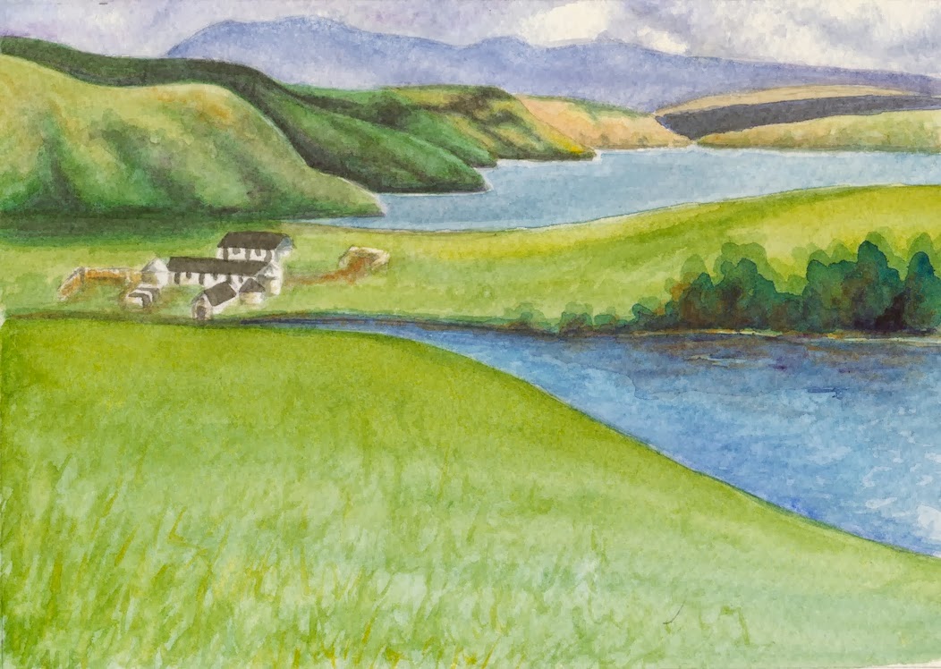
Two are smaller versions of the Isle of Sky paintings I had recently done. Using the same pigments that I used previously: Phthalocyanine Blue, Ultramarine Blue, Chrome Yellow, Aureolin Yellow, Burnt Siena and the shadow color mix I learned in Margaret Walsh Best's workshop. At this smaller size the colors are richer and more intense. Which just points out why I need to create bigger richer puddles of pigment when I do larger paintings.

Two are a smaller version of the dunes on Sapelo Island at sunrise, with a new interpretation of the shadows in the scene and using a new mix of pigments. I used Ultramarine Blue, Chrome Yellow, Aureolin Yellow, Quinacridone Rose, Quinacridone Gold, Burnt Siena, the shadow mixture and the sky in the second version uses Cerulean Blue. The second version has fewer creeping dune plants and a lighter shadow in the sand.


Two are new versions of a watercolor journal entry of the marsh at Little St. Simons Isl.
I used Phthalocyanine Blue, Ultramarine Blue, Chrome Yellow, Quinacridone Gold, Burnt Siena and the shadow mixture to deepen the darkest shadows.


Beautiful! I love the composition of the third one.
ReplyDelete