Showing posts with label technique. Show all posts

Wednesday, February 4, 2026

Winter watercolors

After the recent workshops on perspective and snow, I began work on a painting of a house in the snow.  The reference photo is an extreme angle, but I really like it.  The roof and door of the house are dark green.  The leaves on the trees are also dark green.  The sides of the house are tan-yellow, and the wood of the picket fence is a weathered gray-brown.  However the dominant color is the white of the snow storm.

In my test painting I started by masking everything that was a shade of white, and added some random aplatter for the falling snow.  When the masking was dry, I painted the pale purple-blue sky, the green roof of the house and leaves, the tan-yellow of the house.  When the paint had dried, I removed the masking, and painted in shadows and did some touchup work. 


I used a pallet similar to the one I used for the Georgia Watercolor Society Aug 2025 workshop with Iain Stewart:  
  • Undersea green
  • Phalo blue turquoise
  • Colbalt turquoise
  • Verditer blue
  • Lavender
  • Cadmium Scarlet
  • Naples yellow
  • Burnt Siena
  • Panes Gray

Thursday, January 29, 2026

Working with perspective

In a recent workshop with Leigh Ellis we reviewed the artist rules of perspective that is used to make objects look three dimensional on a two dimensional piece of paper.  It also conveys scale and realism to a painting. 

This is done using: converging lines, vanishing points, color intensity and shifting, edge definition, shadows and highlights.  

For example, the converging lines in this sketch meet at the vanishing point on the right edge of the paper.  They were used to define the height of three people walking toward the vanishing point.  


The same converging lines and vanishing point were used for the watercolor, below along with the other tools mentioned above.  
  • The light from above is brighter around the closest person, making both the highlights and shadows around them stronger. 
  • The closest red umbrella is brighter, while the others are paler and shift to a red-blue.
  • The edges of the closest person where light and dark meet are distinct, but they are less distinct on the further people.

In some cases additional vanishing points are needed to define your view.  For instance a house on a corner would need two vanishing points.  Shadows from the sun or clouds overhead would need additional vanishing points.   


Saturday, April 30, 2022

OCAF & GWS watercolor workshop

Transparent Watercolor on Paper and experimenting with Mixed Water Media on Yupo, a workshop by Mark Mehaffey.  This workshop was offered as part of the 2022 Georgia Watercolor Society's National Exhibition held at OCAF.

It was three day zoom workshop.  During the workshop he provided us with information on his painting methods and techniques.  We were able to ask questions and share our work-in-progress for critique and assistance.  We looked at some of Mark's paintings as part of our discussion.  I would describe the paintings as abstracted realism.  We spent time on planning our paintings.  Using exercises to help us develop the relationship of the shapes, color values.  I learned a lot from the workshop.  

Value studies:

The first watercolor painting was done on heavy watercolor paper with two coats of gesso.  This treatment adds texture and allows easy lifting of paint.  To preserve the paint a sealing coat is sprayed on the painting.  I used a photo of the Grand Tetons from a trip several years ago as my reference.  

This watercolor was done on Yupo, a plastic paper that allows paint to easily flow across the surface.  Paint can also be quickly removed with water.  To preserve the paint a sealing coat is sprayed on the painting.  These are total abstracts.  


Tuesday, September 15, 2020

Watercolor project notebooks

I have a few watercolor project notebooks for different types of painting.  All contain written notes, sketches and swatches of paint.

  • I use small watercolor pads for testing paint mixes while painting. 
  • I use a medium size one for first drafts of cards.
  • The largest one is a sketch book used for projects.

  • The paint testing watercolor pad (shown to the right) has descriptions and examples of color mixes.  Tests for paint transparency.  It also includes the recipe I use as a base for shadows.  


    Below are two pages from a card note pad.  They are test paintings with swatches that identify the colors and mixes used in the painting.  


    The project notebook has sketches, quick paintings, swatches of paint and notes on colors and each test painting that was done.  The page on the left is were done aa part of the Dynamic Watercolors workshop I took at the J. C. Campbell Folk School.  The page on the right are working notes for two paintings from photos of the Grand Tetons National Park.


    Tuesday, August 4, 2020

    Online wattercolor class

    I hadn’t done much painting this year, since all the art classes had been canceled due to the pandemic.  No trips to John C. Campbell Folk School or weekend workshops at Spruill, or classes at OCAF or Lyndon House.   I really needed the push to paint that a class provides.  We meet once a week for four weeks online, and uploaded our finished work to a shared space were we could comment and discuss the paintings.  

    The class focus was on using water to controlling how the paint moves on the paper.  We practiced adding very wet paint to dry and wet paper.  Adding dry paint to wet paper.  Using a dry brush to remove water and paint from the paper.

    Then we painted a landscape from a photo.  I roughly sketched in the buildings and edges of the field.  I wet the sky and painted a morning sky with red and yellow.  I painted in the field where the light was reflecting off the wet grass.  I painted the buildings where the rising sun was casting long shadows.

    I painted the dark tree line and used a dry brush to pick up pigment from the tree tops.  

    I painted the grasses in the foreground, leaving  some areas white for the flowers.  Finally, I added more shadows.


    Next we painted a white dogwood flower.  The only thing defining the white flower are the shadows.  They are soft, but need to be dark enough to give the petals shape.  

    For the center we practiced negative painting.  Painting the dark spaces between the yellow pistils.  

    Finally we used dark paint for the background letting the colors mix.  The darker the background the more the flower shows up.  Too dark or the wrong mix of colors creates a muddy background.

    For the third painting we painted a humming bird.    These birds have distinctive color patterns and shape.  The position of the head, placement of the bill and eye all need to be correct.

    The tips of the wings are indistinct and a trail follows the wings to suggest movement. The pose of the bird suggests reaching up, so I added an orange trumpet vine flower.

    The background was painted wet on wet, allowing the colors to mix.  The darker shades around the flower and bird help define their shapes.


    For my final painting I selected a photo of a pink azalea.  I used one red and one blue pigment for the flower.  

    The lighter pink shades are made by mixing more water with the red paint.  

    The shadows are made by mixing blue into the red paint. 

    The background was painted wet on wet and has indistinct green leaves and additional pinkish flowers.  


    Friday, February 22, 2019

    Watercolor Retreat day 5


    The Final day we painted a girl on the beach.  This was the most challenging painting of the retreat.  There was moving water, reflections on the sand, and a human form.  

    We started by painting the wet sand, leaving the area of the girl’s reflection unpainted.  

    Then we painted the shadows on her clothes.  I used a grey green color for the shadows of the skirt.  It doesn’t look right now, but when red is painted on top the shadows will look right. 


    Next I painted the ocean:

    • Leaving bits of white in the foreground for foam, in the mid ground for waves, and in the background for sun reflections.
    • Adding darker shadows under the waves at the shoreline

    I then painted the girls skin: 

    • Leaving highlights, adding mid tone shadows.
    • Adding her reflections on the sand.


    I painted the girls hair.  Then masked the dots on the skirt and painted it red. The last item was darkening some shadows and finishing the reflection on the wet sand.  


    Thursday, February 21, 2019

    Watercolor Retreat day 4


    The fourth day we worked on a painting of an egret on an oyster bar at sunset.  We used the techniques we had practiced earlier (masking areas of the painting and layering transparent pigments).  

    This time we painted the bird and oysters first.  

    When the painting was dry we masked the bird.  Making sure to cover all the small feathers.

    Then vertical lines of yellow and pink were painted.  Followed by horizontal lines of purple.  The paper and paint were very wet, allowing the paint to flow across the paper and mix.  These lines create the reflections and ripples on the water, as well as the mud of the oyster bar.


    When the painting was dry the masking was removed.  Additional shadows were added to the oysters and mud.  The brush used for the masking didn't have a fine tip so the feathers are a bit blunt, but I still was happy with how the painting turned out.


    Wednesday, February 20, 2019

    Watercolor Retreat day 3


    The third day we worked on a new technique.  Using true transparent yellow, red and blue pigments to paint a marsh at sunset (Aureolin Yellow, Quinacridone Rose & Cobalt Blue).  Most paint is a combination of various pigments.  A true color contains a single pigment.  A transparent paint lets lets you see through one layer of paint to the one below.  

    We first painted yellow where the marsh grass, trees and their reflections in the water are.  After the yellow paint was completely dry we painted red on the sky and water.  

    After the red was completely dry we painted blue on parts of the sky, trees, marsh, and water.  To darken the trees and make the deep shadows in the marsh I added more blue.  It was amazing to see how well this technique worked.


    Ironically, the spring high tide flooded the backyard and the streets around the house we stayed in.


    Tuesday, February 19, 2019

    Watercolor retreat day 2

    After a wonderful breakfast we started working on the next exercise.  An egret flying over the marsh.  I started by painting the sky and water, the colors are reflections of each other. Then painted the shadows on the bird.  The shadows have shades of color from the water (blue to purple) and sun (pink to yellow).  

    When the painting was dry, I masked the bird and painted the marsh, adding yellows and greens to develop depth and distinguish the dry areas of the marsh (yellow to brown) from the wet ones (shades of yellow green).   This was done wet, letting the colors mix.

    I masked part of the foreground of the marsh and continued to darken areas of the marsh and painted the distant trees.  Once the painting was dry I removed the masking.  The masked areas of the march now stand out as lighter colored grass blades.  I completed painting the bird, and adding some final shadows to the marsh and tree line.


    Monday, February 18, 2019

    Watercolor retreat

    What is better then spending time at the beach?  Spending time with other watercolorists at the beach!  Eight of us shared a house at Murrells Inlet SC for the retreat.  Leigh Ellis, a local watercolor artist and teacher, lead daily classes working with us on color mixing, painting birds and water.  

    I brought my Plein air watercolor prochade box, equipped with the paints I needed for class (and a lot more):
    • Cobalt Blue
    • Phthalo blue
    • Burnt Sienna or quinacridone burnt orange
    • Aureolin Yellow
    • Quinacridone Rose  or permanent rose
    • Paynes Gray
    • Qunacridone Gold
    For our first exercise we worked on trees along a grassy bank and reflections on the water. I painted the trees and grass first. Then wet the lower half of the page and working very wet added reflections.  

    It took several passes to develop the shadows on the trees, grass and the reflection in the water.


    While we worked from photos, we were inspired by the marsh outside and trips to Brook Green Gardens.  I had last been there many years ago.  It was wonderful to see how it had grown and all the new sculptures they now have. 


    Friday, April 28, 2017

    At the edge of the forest


    For my final painting I used a photo I had previously taken of a small rock building at JCCFS.  I love the multicolored rocks in the building and the contrast of the shadowed deep woods and open area around the building.  Part of the class discussion, was about narrative.  How do we convey a story through our paintings.  This painting tells a story of living on the edge; between the beauty and unknown of the deep green forest and the structured world humans construct.


    To create the deep green shadowed forest. I masked the trees on the forest edge.  I used a small masking fluid container that had a thin tube applicator, which I thought would make it easier to apply.  But it wasn't as easy as I expected.  The tree trunks were large and I needed to use a masking brush to cover them effectively.  The branches were smaller, but where the branches and trunks met I had problems controlling the fluid, causing blobs.  This was the first time I had used this type of masking application.  In retrospect I should have done some testing and had a well thought out plan for my application.

    After the masking was completely dry, I wet the paper and used saturated pigments to create the vibrant dark green depths and light in the forest.  While the paper was still wet I used the side of a credit card to scratch in branches.  Scratching the wet paper let the pigments penetrate and create dark lines.  This worked very well, but next time I will try to vary the size of the scratches to imitate the change in branch size more accurately.

    I carefully removed any excess paint from the masked areas.  This is an important step to keep unwanted pigment from accidentally getting on other parts of the painting.  I proceeded to paint the light green lawn and rock house in the foreground.  I enjoyed painting the multicolored rocks and distressed wood of the shed.


    Now It was now time to remove the masking fluid and paint the trees.  Once the trees were painted I added in darker shadows on the lawn and rock house.  The final addition was the red bird house at the upper left.  The addition of that bird house changes the feel of the painting.

    Friday, April 21, 2017

    Bone yard

    For the second painting I used a photo recently taken on the north end beach of Bulls Island NC as my reference.  Barrier Islands like this one are constantly changing.  The currents and waves push and pull the sand on the beaches, constantly reshaping them.  Northern ends of the barrier island on the Atlantic coast looses sand, while their southern end gains sand.  On Bull Island the erosion of the send on the north end in the past few years has been extreme.  Old forests of oak, pine and palms have been left stranded on the beach where they die.  In this boneyard the bleached and worn skeletons cast eerie silhouettes against the sky and water.  A beautiful but sad reminder of the how fragile life is.

    I made a small sketch to work out my color pallet and to practice the wet washes for the sky and sand; and dry brush techniques for the waves and tree textures.  This also gave me a chance to work out which branches were in front and which were behind.  Helping to define the depth of the painting.

    The larger painting uses the same colors, but I darkened the sky and water, lightened the tree's shadow and added added more brown to the tree.  These changes shift the viewers focus to the tree skeleton.


    Friday, April 14, 2017

    Daffodil larger then life


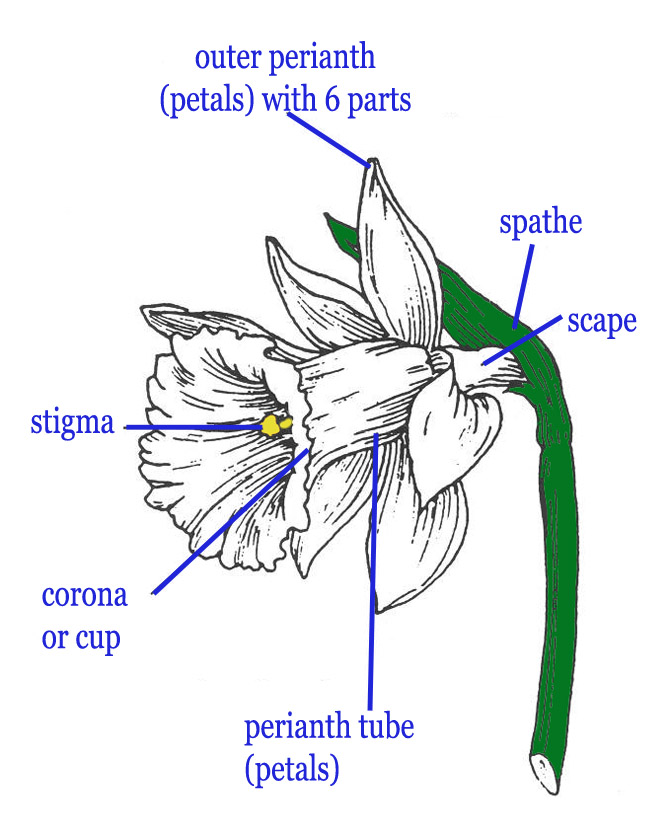
    Before the snow and sleet arrived, I picked a few bright daffodils to sketch.  I kept the flowers in my fresh water glass throughout the week as inspiration.  One of the sketches was used as the basis for my first large watercolor.  The sketch captures the flower and leaves leaning out of the cup.  The bright red of the corona's lip reflect on the surrounding flower, even in the bluish shadows.  I used this sketch as my thumbnail for the larger painting.  I drew a box around the part of the sketch I wanted to use in my larger painting.  At the bottom of the sketch are some color mix test blocks.  I used them to help me decide which pigment combinations to use while doing the sketch and for the background in the larger painting.  

    For the larger watercolor I pushed the colors to make a more vibrant painting.  I increased the reflected colors on the petals and added Quinacridone Gold to the shadows.  I also added a wet in wet background of blue and green to provide contrast.  The result is a bright cheerful spring painting, that communicates that feeling.


    Sunday, April 9, 2017

    JCCS Dynamic watercolor workshop

    I spent an unexpectedly cold week at the John C. Campbell Folk School in March while taking a class in Composing Dynamic Watercolors.  Taught by instructor Annie Pais and assistant Suzy Deslauriers. We had hoped to be able to do some plien air painting around campus capturing spring unfolding, but it was too cold for that.  Instead we stayed in the studio, painting still life compositions or from photos.  Working in the studio all week had advantages.  We had group exercises and provide were able to provide feedback to each other while actively painting.  I really enjoyed the social interactions and watching everyones paintings come to life around me.

    We started our class with some drawing exercises.  We did several blind contour sketches of each other while sitting in our discussion circle.  This turned out to be a lot of fun, both to do and to share.  Sometimes the images look more like a Picasso, then the person we were drawing.  Mine exhibited disembodied heads and disjointed faces, but the drawings still contained aspects of the people I was drawing.  

    Then we moved on to do some blind contour, contour and thumbnail sketches of objects around the studio.  We arranged several objects then used a view finder to help us select the composition to use for our thumbnail sketches.


    Blind contour Contour Thumbnail sketch