Friday, December 22, 2017

Handmade Books: dying leather

This past fall I decided it was time to start using the natural vegetable tanned leather I bought a few years ago to make books.   The veg tan leather would need to be cut, dyed and sealed before I could use it to make books.  All of the leather books I previously made used pre-tanned and dyed leather.  I had been hesitant to use the leather until I understood how to dye it.  I read several articles on dying leather and watched several videos tool.  In the end I decided to pick some dyes and give them a try.

Leather is often finished using a tan, brown or black oil or alcohol based dye.  I started by using Fiebing’s Tan Dye.  It took a few coats to cover the leather evenly, but I liked the final color and look of the finished leather.  Fiebing’s site has instructions on how to use their dye

I also tried Eco-Flo Dye Pack colors.  These are water based dyes that can be mixed to create a variety of different colors.  I mixed water with the red, blue and green to create lighter shades; and mixed the red and blue to make several different violet and purples.  The resulting leather was colorful but still soft.  The finished books were very well received.

All of the books I made this fall have found new homes!

Saturday, November 18, 2017

Handmade Books: stamping

Vegetable tanned leather is perfect for stamping and impressing images.  However, this needs to be done before the leather is dyed and sealed.


Let the leather soak in warm water until it is spongy.  Wipe off the excess water and let the leather sit for a few minutes, until the surface is no longer looks wet.

I have a celtic stamp set with several heads that snap onto a handle.  I photo shows a regular hammer, but you should use a hammer or maul designed for leather working.  Steel hammers will damage the tools.  Hold the design part of the stamp in place to reduce chatter (multiple impressions because the stamp moved).  Hit the handle hard several times.  You want to make sure the whole stamp image is impressed into the leather.

Let the leather dry completely before dying.  

Wipe the dye over the leather except for the stamped area.  Once the color is even, lightly wipe the dye over the stamped area.  The image stands out best if the impressed area is either lighter or darker then the rest of the leather.  The more you work it the more even the stamped area's color will be.  For more precise control, use a Testors micro sponge hobby brush to touch up and darken small area around the stamped image.


Saturday, September 23, 2017

Sketching in Maine

In the Spring we made plans for a fishing trip to Montana.  We would be staying in a National Forest Service cabin in the back woods near a favorite creek.  Then the fires came.  We watched the fire and weather reports as the wildfires drew nearer and nearer to the area we were planning to stay.  People were evacuated and roads were closing as the wild fires raged.  Fire fighters were fighting fires all throughout the west.  Smoke from the fires we effecting the air quality throughout the west.  We would not be going to Montana.

Instead we went to Maine.  We stayed at a lovely cottage on Little Deer Isl.  We could see the water from the cottage, and ate several dinners on the porch watching fiery sunsets.

Sunrises and sunsets like these call out to be painted.  Capturing the constantly changing colors and deep shadows before they vanish is a challenge.  Luckily I was given several opportunities to try.


Maine's rocky coast is filled with bays, inlets and small islands.  It was a perfect place to spend time exploring and hunting for lighthouses.  We visited Stonington on nearby Deer Island several times, enjoying local good seafood.  We also took a cruise from Stonington out to the Isle au Haut to see the unique Robinson Point Light house.  We spent a day at Acadia National Park; hiking Cadillac mountain, driving along the park loop road and eating seafood in Bar Harbor.  We traveled along the coast north to West Quoddy Head Lighthouse.  This is the easternmost point of land in the continental United States, and around the equinoxes it is the first place sunlight touches.

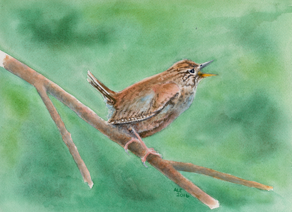
I have many photos from this trip that someday will be used as references for paintings.  I did finish three watercolor sketches while we were in Maine.  Besides the sunset above, I sketched some garden flowers and a also a beach scene.


Friday, April 28, 2017

At the edge of the forest


For my final painting I used a photo I had previously taken of a small rock building at JCCFS.  I love the multicolored rocks in the building and the contrast of the shadowed deep woods and open area around the building.  Part of the class discussion, was about narrative.  How do we convey a story through our paintings.  This painting tells a story of living on the edge; between the beauty and unknown of the deep green forest and the structured world humans construct.


To create the deep green shadowed forest. I masked the trees on the forest edge.  I used a small masking fluid container that had a thin tube applicator, which I thought would make it easier to apply.  But it wasn't as easy as I expected.  The tree trunks were large and I needed to use a masking brush to cover them effectively.  The branches were smaller, but where the branches and trunks met I had problems controlling the fluid, causing blobs.  This was the first time I had used this type of masking application.  In retrospect I should have done some testing and had a well thought out plan for my application.

After the masking was completely dry, I wet the paper and used saturated pigments to create the vibrant dark green depths and light in the forest.  While the paper was still wet I used the side of a credit card to scratch in branches.  Scratching the wet paper let the pigments penetrate and create dark lines.  This worked very well, but next time I will try to vary the size of the scratches to imitate the change in branch size more accurately.

I carefully removed any excess paint from the masked areas.  This is an important step to keep unwanted pigment from accidentally getting on other parts of the painting.  I proceeded to paint the light green lawn and rock house in the foreground.  I enjoyed painting the multicolored rocks and distressed wood of the shed.


Now It was now time to remove the masking fluid and paint the trees.  Once the trees were painted I added in darker shadows on the lawn and rock house.  The final addition was the red bird house at the upper left.  The addition of that bird house changes the feel of the painting.

Friday, April 21, 2017

Bone yard

For the second painting I used a photo recently taken on the north end beach of Bulls Island NC as my reference.  Barrier Islands like this one are constantly changing.  The currents and waves push and pull the sand on the beaches, constantly reshaping them.  Northern ends of the barrier island on the Atlantic coast looses sand, while their southern end gains sand.  On Bull Island the erosion of the send on the north end in the past few years has been extreme.  Old forests of oak, pine and palms have been left stranded on the beach where they die.  In this boneyard the bleached and worn skeletons cast eerie silhouettes against the sky and water.  A beautiful but sad reminder of the how fragile life is.

I made a small sketch to work out my color pallet and to practice the wet washes for the sky and sand; and dry brush techniques for the waves and tree textures.  This also gave me a chance to work out which branches were in front and which were behind.  Helping to define the depth of the painting.

The larger painting uses the same colors, but I darkened the sky and water, lightened the tree's shadow and added added more brown to the tree.  These changes shift the viewers focus to the tree skeleton.


Friday, April 14, 2017

Daffodil larger then life


Before the snow and sleet arrived, I picked a few bright daffodils to sketch.  I kept the flowers in my fresh water glass throughout the week as inspiration.  One of the sketches was used as the basis for my first large watercolor.  The sketch captures the flower and leaves leaning out of the cup.  The bright red of the corona's lip reflect on the surrounding flower, even in the bluish shadows.  I used this sketch as my thumbnail for the larger painting.  I drew a box around the part of the sketch I wanted to use in my larger painting.  At the bottom of the sketch are some color mix test blocks.  I used them to help me decide which pigment combinations to use while doing the sketch and for the background in the larger painting.  

For the larger watercolor I pushed the colors to make a more vibrant painting.  I increased the reflected colors on the petals and added Quinacridone Gold to the shadows.  I also added a wet in wet background of blue and green to provide contrast.  The result is a bright cheerful spring painting, that communicates that feeling.


Sunday, April 9, 2017

JCCS Dynamic watercolor workshop

I spent an unexpectedly cold week at the John C. Campbell Folk School in March while taking a class in Composing Dynamic Watercolors.  Taught by instructor Annie Pais and assistant Suzy Deslauriers. We had hoped to be able to do some plien air painting around campus capturing spring unfolding, but it was too cold for that.  Instead we stayed in the studio, painting still life compositions or from photos.  Working in the studio all week had advantages.  We had group exercises and provide were able to provide feedback to each other while actively painting.  I really enjoyed the social interactions and watching everyones paintings come to life around me.

We started our class with some drawing exercises.  We did several blind contour sketches of each other while sitting in our discussion circle.  This turned out to be a lot of fun, both to do and to share.  Sometimes the images look more like a Picasso, then the person we were drawing.  Mine exhibited disembodied heads and disjointed faces, but the drawings still contained aspects of the people I was drawing.  

Then we moved on to do some blind contour, contour and thumbnail sketches of objects around the studio.  We arranged several objects then used a view finder to help us select the composition to use for our thumbnail sketches.


Blind contour Contour Thumbnail sketch


Sunday, March 26, 2017

Watercolor bird workshop

I recently had the opportunity to attended a watercolor workshop at Oconee Cultural Arts Foundation by Leigh Ellis.  Leigh paints wonderfully vibrant watercolors, many are natural landscapes or wild animals.  This workshop focused on painting birds.  Leigh provided us with many tips from her many years as a painter and naturalist.  I was inspired by Leigh's teaching and the great paintings of the class members.  I look forward to attending future classes Leigh has.

During the workshop I worked on three paintings: a Red Ibis, Warbler and Rooster.  Before sketching the Ibis we discusses bird anatomy and how correct positions of the head and bill improve the realistic look of the painting.  The Ibis is basically all the same color with slight differences in value.  The changes in light across the bird's plumage are what provide shape for the wings and body.  I left out all but a few leaves and branches, letting the red bird stand out from the dark wet on wet background.

For the Warbler painting I focused on the attitude of this feisty little bird; clinging to a small branch, tail cocked singing out for all the world to hear.  A variety of browns, pale blue and hints of red makeup both the bird and the branch he sits on.  The background is a wet on wet mix of greens.

In contrast, the Rooster is full of many vibrant colors.  I didn't paint individual feathers, but grouped the feathers to define the birds shape.  Some of painting is knowing how to let the viewer "see" what is not actually there.  Distance, depth, 3D and even color are achieved by the combination of what is painted and what our brains perceive.  For instance, the juxtaposition of dark and light colors provide the "shine" of the Rooster's tail feathers. Only one tail feather stands out, the one that is out of place.  Maybe it was pulled during a scuffle in the farm yard.

Saturday, January 28, 2017

Virgin Island colors

There is nothing like the tropics for intense colors; Bright turquoise seas and vibrant green coasts; Brilliantly colored flowers and birds.  The natural tropical colors effect everything and everyone.  Houses are painted turquoise, pink, red and bright green.  People wear bright floral shirts and dresses.

I took my smallest travel kit with me on my recent sailing trip in the Virgin Islands.  It includes a Van Gogh water color pocket box and a small Mole skin watercolor notebook.  The kit's palette includes cold and warm blues, reds and yellows; along with yellow ochre and burnt sienna.  These are usually perfect for everything I paint, but in the tropics I wished I had also taken some other colors like, Quinacridone gold and Opera pink.

Below is a sketch I did from the balcony of our hotel in Charlotte Amalie, St. Thomas USVI while waiting for breakfast.  The blue sky mirrored the blue of the bay.  Green palms, banana and mango trees reached up through gaps between buildings.  The rising sun reflected off the red roofs throughout the town.  Mixing Permanent Yellow and Madder Lake Deep provided the various shades of yellow, orange and red I was seeing.


For the rest of the trip we stayed aboard our sailboat, traveling from one island to another.  We did spend three days at Cane Garden Bay, Tortola BVI.  While there I was able to do another sketch from the boat.  The turquoise of the water was done by layering Cerulean blue on top of Azo yellow.