Sunday, April 9, 2017

JCCS Dynamic watercolor workshop

I spent an unexpectedly cold week at the John C. Campbell Folk School in March while taking a class in Composing Dynamic Watercolors.  Taught by instructor Annie Pais and assistant Suzy Deslauriers. We had hoped to be able to do some plien air painting around campus capturing spring unfolding, but it was too cold for that.  Instead we stayed in the studio, painting still life compositions or from photos.  Working in the studio all week had advantages.  We had group exercises and provide were able to provide feedback to each other while actively painting.  I really enjoyed the social interactions and watching everyones paintings come to life around me.

We started our class with some drawing exercises.  We did several blind contour sketches of each other while sitting in our discussion circle.  This turned out to be a lot of fun, both to do and to share.  Sometimes the images look more like a Picasso, then the person we were drawing.  Mine exhibited disembodied heads and disjointed faces, but the drawings still contained aspects of the people I was drawing.  

Then we moved on to do some blind contour, contour and thumbnail sketches of objects around the studio.  We arranged several objects then used a view finder to help us select the composition to use for our thumbnail sketches.


Blind contour Contour Thumbnail sketch


Sunday, March 26, 2017

Watercolor bird workshop

I recently had the opportunity to attended a watercolor workshop at Oconee Cultural Arts Foundation by Leigh Ellis.  Leigh paints wonderfully vibrant watercolors, many are natural landscapes or wild animals.  This workshop focused on painting birds.  Leigh provided us with many tips from her many years as a painter and naturalist.  I was inspired by Leigh's teaching and the great paintings of the class members.  I look forward to attending future classes Leigh has.

During the workshop I worked on three paintings: a Red Ibis, Warbler and Rooster.  Before sketching the Ibis we discusses bird anatomy and how correct positions of the head and bill improve the realistic look of the painting.  The Ibis is basically all the same color with slight differences in value.  The changes in light across the bird's plumage are what provide shape for the wings and body.  I left out all but a few leaves and branches, letting the red bird stand out from the dark wet on wet background.

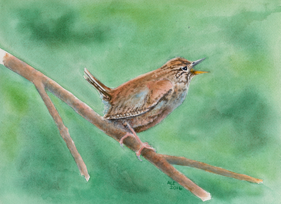
For the Warbler painting I focused on the attitude of this feisty little bird; clinging to a small branch, tail cocked singing out for all the world to hear.  A variety of browns, pale blue and hints of red makeup both the bird and the branch he sits on.  The background is a wet on wet mix of greens.

In contrast, the Rooster is full of many vibrant colors.  I didn't paint individual feathers, but grouped the feathers to define the birds shape.  Some of painting is knowing how to let the viewer "see" what is not actually there.  Distance, depth, 3D and even color are achieved by the combination of what is painted and what our brains perceive.  For instance, the juxtaposition of dark and light colors provide the "shine" of the Rooster's tail feathers. Only one tail feather stands out, the one that is out of place.  Maybe it was pulled during a scuffle in the farm yard.

Saturday, January 28, 2017

Virgin Island colors

There is nothing like the tropics for intense colors; Bright turquoise seas and vibrant green coasts; Brilliantly colored flowers and birds.  The natural tropical colors effect everything and everyone.  Houses are painted turquoise, pink, red and bright green.  People wear bright floral shirts and dresses.

I took my smallest travel kit with me on my recent sailing trip in the Virgin Islands.  It includes a Van Gogh water color pocket box and a small Mole skin watercolor notebook.  The kit's palette includes cold and warm blues, reds and yellows; along with yellow ochre and burnt sienna.  These are usually perfect for everything I paint, but in the tropics I wished I had also taken some other colors like, Quinacridone gold and Opera pink.

Below is a sketch I did from the balcony of our hotel in Charlotte Amalie, St. Thomas USVI while waiting for breakfast.  The blue sky mirrored the blue of the bay.  Green palms, banana and mango trees reached up through gaps between buildings.  The rising sun reflected off the red roofs throughout the town.  Mixing Permanent Yellow and Madder Lake Deep provided the various shades of yellow, orange and red I was seeing.


For the rest of the trip we stayed aboard our sailboat, traveling from one island to another.  We did spend three days at Cane Garden Bay, Tortola BVI.  While there I was able to do another sketch from the boat.  The turquoise of the water was done by layering Cerulean blue on top of Azo yellow.